Tribute to UNR Executive MBA Class 2021

With my Blog focused on training and development, I’ve created a tribute to one of the best means to improve your academics, personal development, skills, and confidence to succeed in any business. My video pays homage to a remarkable program offered by the University of Nevada, Reno – The online Executive MBA program.

I completed my Executive MBA in 2021, a two-year journey full of unexpected events and challenges. I am so pleased that I decided on this particular program due to the extraordinary leadership and outstanding professors who take a deep interest in supporting mature working students to succeed in the program. My cohort was made up of exceptional leaders and tough-minded learners that powered through some of the most challenging business cases and game theory assignments. The EMBA class of 2021 was the first to succeed at an advanced Strategy Game Theory assignment. It was a fierce group challenge, one where the professor had low expectations since no class in his over 20 years of teaching had won. We did it – as a group and achieved what no other team could realize, the true meaning of a cohort (a group of people banded together, a supporter and companion, together to achieve similar outcomes).

The video will introduce the overall content of a two-year Executive MBA program, illustrate some of the material provided during the program, show the professors and the graduating class of UNR EMBA 2021.

Congratulations to this special team for succeeding at an amazing program!

Make a Video from PowerPoint

I’ve just made a five-minute video on my blog site and thought I would share how I did it in PowerPoint.

Using Microsoft PowerPoint can be much easier than most video editing software. The new “Record Slide Show” feature allows you to voice over each individual slide, then you can export to a video file. The final video is a seamless transition of your slides and is one of the quickest ways to create a professional looking video.

Let’s face it, any video editing will take some time if you don’t work with it every day. Microsoft offers an easy to use “Video Editor” (access this program by typing in “Video Editor” in the start field at the bottom left of windows). This works really well if you record a video from your phone and need to crop or overlay some cool effects. I highly recommend trying this free video editor for your quick videos.

However, when you are working on an extensive video and want to add more content including transitions for graphics and utilize notes to read for each slide, I recommend PowerPoint.

While I provide a short video on my editing experience – you could just go straight to one my favorite YouTube Microsoft MVPs, Kevin Stratvert to learn from one of the best. His videos are excellent – he is always to the point and his tips and overall recommendations are noteworthy. I’m providing his video below which is a more comprehensive recording session at 6 minutes and 44 seconds. He illustrates the video narration option and other rich content options. I often watch the videos at 1.5 speed so the video length can be reduced by 2 minutes. It’s worth a review.

A quick overview of how I made my recent video is shown below and contains similar (but less detailed content than Kevin). My video does not include the self video recording option – only audio. Let me just disclose that it’s so much easier to dress for an audio recording…

My video is two minutes less time than the video above. You’ll see both my monitor screens and notice that I had Google Earth Pro open (globe image) on my second screen while not using PowerPoint. One topic not mentioned in my video that is a helpful option – if you insert a phone video into a PowerPoint slide by selecting “insert” then the video icon to the right of the ribbon, you are able to crop the video inside of PowerPoint. You can crop the start and the end of the video. After you insert a video into your slide, left click the video and a “Playback” will appear and you’ll have a “trim video” option among other features.

Using Excel for Office Layouts. hmmm.

Here’s a tip on the topic of office layouts with Microsoft Excel.

In my prior blog helped with organization charts, now I’m going to provide a recommendation on where those employees should sit. Working with office layouts can be difficult and the software can be onerous and difficult to learn. Architects and designers use AutoCad or Revit which practically takes a degree to understand and use.

The program Microsoft Visio is excellent for office layouts, since it can draw the office to scale to help with when deciding additional furniture or changes to accommodate more or less employees. However, we really don’t often need to manipulate the office layout as much as to manage where people are sitting. In a large office setting, it’s always nice to have a visual to understand where everyone is sitting. This office layout solution will enable you to search for team member locations.

The pandemic has made incredible changes to the workplace including turnover and working from home.

Many people have had to adjust their office seating, and I have been using Excel to solve the seating arrangement within an office layout.

The overall process is adding your office layout as a picture in Excel, then adding text boxes on top of that graphic. I change the look of the text boxes by making them darker so they stand out above the layout. Next I use a little know trick of add a formula inside a text box in Excel, sounds complicated. It’s only one character – the equal sign “ = “. The equal sign allows you to link to a list of names to the layout.

Adding text boxes to the layout is faster than you think since you can copy and paste the text boxes to quickly add up the layout. Then after linking each box to the list of names, you can update the list quickly for any adjustments. Keeping different floors or building in one Excel file will allow you to search (“Ctrl F”) for an employee name in any of your buildings or floors. I have used this example with great success to manage turnover of offices and cubicles. It helps you understand the total occupancy of your building and having a visual of the floor is just an awesome feature for new team members.

Just Amazing Org Charts

Microsoft offers some of the most formidable business software programs to handle your business needs. One of the best features of the suite of software is the similar look and feel between the different programs. But it’s far more than being able to copy material, or insert the material between the MS Word, Excel, PowerPoint, OneNote, Project, Publisher, Access, and Visio and others. There is one feature that requires the combination of Excel and Microsoft Visio. It’s used to make an organization chart or process flow.

You simply follow a basic setup of the header row with the label “ID” in the first column, then “Reports to” in the next column, and the rest is easy.

You’ll create an org chart that can represent any data you would like to display. I found this tool valuable to create charts for different people and purposes from the same data source. Since the core information is contained in Excel, the data is easy to manipulate, modify and revise. I was able to create a 6,000 person org chart for a prior large development. The org chart was enormous, so I printed it using a plotter – the output was a full-size architectural layout, the size of 3 movie posters. The visual was 3ft tall by 6ft wide and represented the entire company with it’s 11 division of team members. Colleagues would come into my office and find there position – they like to show off their specific location among the sea of people on the chart. It was a helpful illustration to understand the organization and to create “what if” scenarios by moving 70 departments around to create the best system to achieve the operational goals.

Visio is a remarkable program for planning since it can also help with office layout planning. It can receive PDF drawings from AutoCAD at scale. This enables the software to manage department layouts with accuracy. AutoCAD is complex software that requires considerable training and used primarily by architects and professional designers. Visio is much easier to learn and use and can be quickly learned since it is a Microsoft product with familiar tools and icon ribbon. It doesn’t always come with the base office Microsoft suite, however you may have the program and don’t know it! If you don’t you may be able to use an online version or buy it separately if you work with org charts and office layouts often. This is the same scenario for the software Microsoft Project, it may or may not be available in the MS office suite package you own.

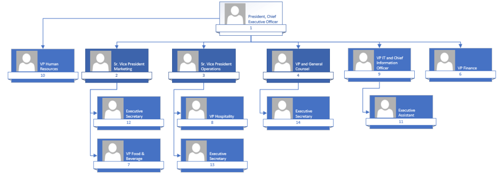
Here is a quick org chart created in the video. Pictures and phone extensions can be added to make the chart more interesting and informative.

It’s the combination of using Excel and Visio that makes creating org charts easy, fast, and effective in displaying important information. One of the best use of this approach is for each department and overall division to have an electronic copy of their organization available on Microsoft SharePoint (it’s the web building platform of Microsoft). Understanding how your department, division and company work together and structure is paramount to know to effectively communicate with each other.

MS Word Useful Features!

Microsoft Word is one of the most common and widely used software applications throughout the world. I use MS Word nearly every day, and since I have the Office 365 online version, there are ongoing updates that happen every day. Today, I would like to share just a few MS Word features that I think are generally underutilized. I notice this in my workplace and with others who would benefit from some of the most fundamental options to improve your document.

Beginning with header Styles, they can transform a basic report or memo from ordinary to remarkable. Why settle for bold paragraph headers when you can add different fonts, font sizes, colors, shading, and more. All at a click of a button with a live preview to see the updates to your document. They have been conspicuously placed in the center of the home ribbon. Just highlight your paragraph headers and double click the format painter to apply. Then select the Design option to the left of the same ribbon, and you just kicked up your document to the pro level.

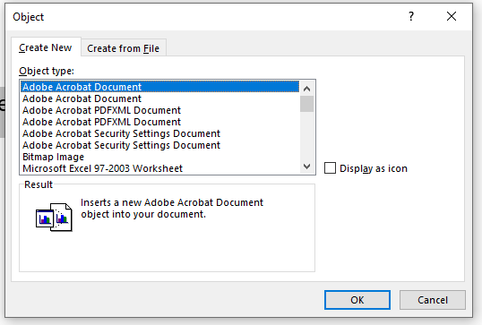
Next, most people don’t know they can insert other Microsoft files into their Word document. You can insert a pdf file directly into a file. It’s a little tricky since the option is not located in the “insert Pictures” area; instead, it is to the far right of the home ribbon under the option “Object.” You’ll then select “Create from New” and browse for the file. I always select “Display as Icon” so the file will be inserted into a separate document. Otherwise, the contents of the file will be inserted.

I also provide a playful option to add 3D graphics to your MS Word document. They are technically 3D models; the default stock selection is robust; however, find nearly any 3D object you need on the internet. The best illustrated 3D objects with high resolution may cost if you are looking for something very specific. However, I’ve never paid for a 3D model for MS Word or MS PowerPoint yet. There are helpful “align” tools in all the MS suite programs that help you arrange your graphics just right.

I highly recommend an MS Word YouTube channel named Simon Sez IT link.

Thanks for tuning in, and I hope you try some of these MS Word features if you are not using them already!

Better Excel Charts!

I am an Excel graph connoisseur. I look at graphs differently than many people, sure I look at the data and the message they are trying to communicate, but I look much deeper. I look at the rotation of the axis labels, the thickness of the bars, or if they added gradient shading or a 3D effect. Did the graphic artist consider layering the graphs by using the combo graph feature? I’m so disappointed when published articles from reputable business publications use out-of-the-box, vanilla-style charts to express their message. Please take a little more time to be clever and at least make all the words readable.

One of my pet peeves is when the vertical axis is not rotated to read left to right. Please take the time to make it easier to read for your audience. Also, please use more color with labels and data so the reader can understand which data relates to which data point.

Please don’t use plain flat colors when you can use gradient coloring to provide a more 3D effect without using the 3D option, which often distorts the graphic trends by twisting the graph.

There are many upgrades to an Excel graph that can be performed. It really just takes a little time to make your output a little more polished. How I improved my Excel graphing skills was to simply benchmark others who were much better than me. I found that Excel can duplicate nearly any graph. Try looking at the Wall Street Journal or, better, the Economist for some creative data illustrations. I kept trying to improve my skills by replicating others and by watching a few good YouTube videos.

Please cover the basis when graphing – to be sure your message is understood, all the fonts are readable, and add additional text when needed. It is truly a rewarding experience once you develop an impressive graph template to use in the future. Happy graphing!

Below is a how to video that improves a standard Excel chart to a more interesting and readable graph.

Visual Poetry of Business

If you’ve seen my prior blog posts, you’ll know I’m always on the hunt for the best way to organize, analyze and present data. One of the best professional business websites I have used as a graduate student and in my workplace for strategic planning and evaluation of project development is Statista.com. This site is focused on providing visualizations of data through intelligent infographics. The site is widely known as the best resource for worldwide stats and any major company or industry.

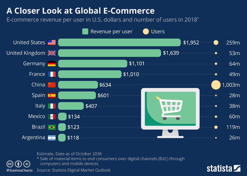
Feldman, S. (November 26, 2018). A Closer Look at Global E-Commerce [Digital image]. Retrieved July 11, 2021, from https://www.statista.com/chart/16215/global-ecommerce-revenue/

The beauty of Statista is that it assembles the data in Excel, graphs the data, and provides a comprehensive report. The entire report is downloadable in PowerPoint, Excel, MS Word, or PDF. It can save hours, days, or even weeks to review a specific company, industry, or topic. The service is highly in tune with major trends and provides comprehensive topical reporting such as with Covid and vaccine news. Its headquarters are in Germany, but they have offices all over the world.

In terms of reporting, as an example, today’s highlighted reports include Coronavirus, Social Media, E-Commerce, Smartphones, China, Cosmetics, Gaming, Film Industry, and the United States. The latest updated infographics and data within each of these topics are provided. The trends are presented in bar graphs, line graphs, pie charts, and innovative dashboards to understand the complete picture. A typical full “dossier” report will provide from 60 pages to 100 pages of data. Information I have downloaded includes data on Facebook, Google, Apple, Tesla, IKEA, Southwest Airlines, etc. The reports are available by industry and will list the top 10 or 20 companies in a particular field. The companies are compared on specific vital statistics so you can quickly understand the market. With Statista, I do believe a picture is worth 1,000 words.


In the video above, I provide some screenshots of example infographics and reporting available. There is also a one and half minute overview of the company by the founder Dr. Friedrich Schwandt.

https://www.statista.com/

Global Community Learning

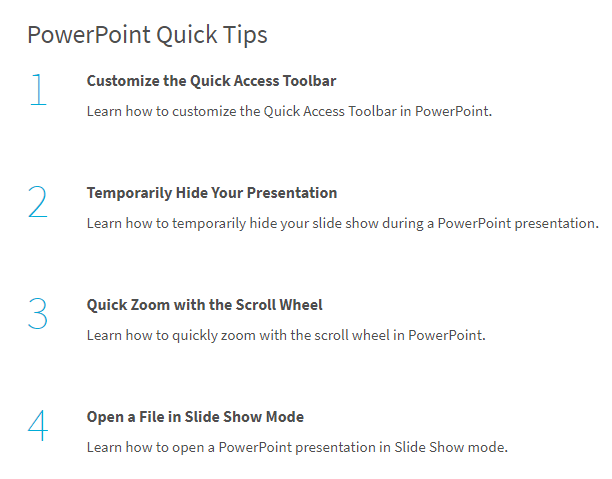
In order to share some Microsoft knowledge, I would like to introduce you to a one of my favorite learning websites. The site is created by the Global Community Foundation at edu.gcfglobal.org. This is a free platform that provides software learning and much more in an effective and short video training format (1 minute long videos).

In my recommendation today, I review how to recover unsaved PowerPoint presentations. I have used this in the past and was thankful I watched the quick tutorial on how to recover unsaved files. This website provides 21 quick learn videos for PowerPoint and all of the other core Microsoft suite software.

https://edu.gcfglobal.org/en/powerpoint-tips/

The graphic below is a short list of several of the 1 minute videos:

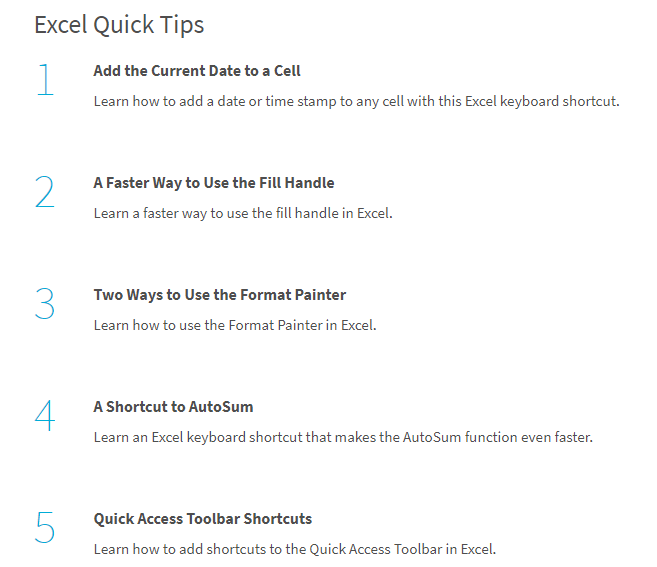
I am passionate about learning the latest with Microsoft Excel, although sometimes I like to check in and be sure I’m not missing any of the basics. With the free Global Community Foundation website, there are excellent beginner, intermediate and advance tips.

https://edu.gcfglobal.org/en/excel-tips/

Just a few quick tips below for Excel:


Here is my 3 minute video that highlights the PowerPoint learning located at GCF Learn Free website:


Below are my favorite Tip websites regarding Microsoft:

GCFLearnFree.org

https://edu.gcfglobal.org/en/powerpoint-tips/

https://edu.gcfglobal.org/en/excel-tips/

https://edu.gcfglobal.org/en/word-tips/

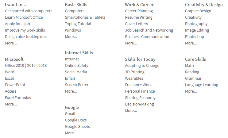
There is much more at the GCG learning website – beyond Microsoft software. Below is a graphic showing a sample of the learning list (below is not the comprehensive list)

Check it out and learn something new in one minute!

What’s Up with Windows 11

I recently listened to an interview with Satay Nadella, CEO Chairman of Microsoft who discussed some of the best new features of Windows 11. Any new Windows update will have some controversial reviews, but from what I see, it’s impressive. The Windows development team is trying to keep up with the modern demands of all users and is making some bold partnerships to capture more market share.

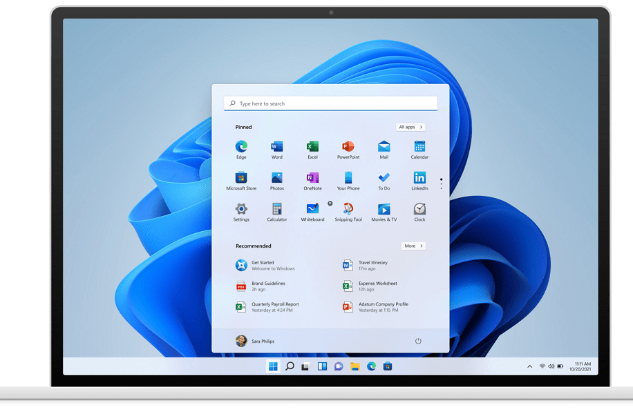
One massive optics change is the start button is moving to the center of the screen. The notion of “Center” is important to Windows and I think it may be a play to be more of the center of your software and online activities.

Windows is taking a more open approach to the market place likely due to the recent Anti-Trust lawsuits with Apple and other major software players. Windows is partnering with the Amazon to offer Android Apps to be used on their software. That is COLOSSAL change. I believe the Windows community will benefit from this partnership.

Some other improvements include new sounds and themes – I personally like the alarm sound and play a sample in my video below. There is an option to use multiple Desktops. I dislike when I’m on a work video call and everyone gets a glance of my crowded desktop, I could be more organized.

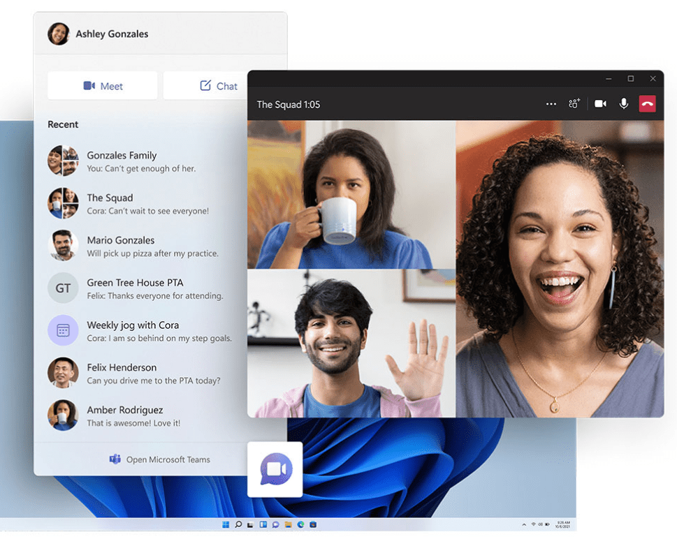
There is a software feature emphasis for video calls now that we are on work or personal call nearly everyday of our lives.

If you need to know more about any particular new feature in this release or if you are interested in trying a download – I recommend watching more YouTube videos. Several reviews contain a few specific warnings since it is in the beta stage. Most of the review pros always download the test versions on separate PCs from their main device. I would caution anyone from downloading early versions on their primary computer. There are numerous reviews online with more being posted everyday.

You can check out the Microsoft teaser video with comments contained in video

Solving Problems with 3D Graphs

Today we’ll tackle the most challenging and complex problems you need to solve using Excel’s scatter graph option. I find the bubble option most appealing. The default solution to your data will provide a 3D visual. For me, looking at a large table of data is hard to visualize a solution. This tool best represents the expression “a picture is worth a thousand words.”

I’ll provide two examples in my video, and the first would be used to address any decision that involves a listing of options with at least three critical variables. Consider the various products or services offered by your business. Are you covering the range demanded by your customers?

The restaurants’ portfolio is offered with the following three dimensions: the price of meals, casualness (casual or upscale), and the number of seats per restaurant. From the bubble chart, you can visualize a gap in your offering and fill the gap with a solution that best solves all dimensions. To step up the graphic, you can change the color of the bubbles to represent another variable to add the 4th dimension. Finally, you could add a line surrounding the bubble to define the 5th dimension.

The second example is more complex; it tackles a portfolio of IT artificial intelligence projects. The deliverable will provide a visual of 15 project types with as many as 5 dimensions of variables. You’ll note there is some background music for inspiration for this example.

The IT artificial intelligence project output helps you grasp the data to make a much more informed decision about how to prioritize your projects given the constraints of your time and budget. What can you accomplish that will deliver the most effective results for your organization.

The often biggest challenge is deciding how to organize the visual for your problem. While many details are often known, you may need to assign subjective ranking scores to create your portfolio illustration. Once you see the result of graphing the data, you’ll understand the usefulness of the X Y Scatter graph in Excel.


I hope you consider downloading and using the Excel template provided below the video.